5/22/2023
While searching for cool sites to explore, I came upon the site https://onomeals.zeusjones.com. This site uses a simple and easy to understand grid yet it makes me keep wanting to look at it. The branding of this website is pretty strong with the colors and the typography. It uses mostly a two-columns grid, but it works so well because of the hierarchy.
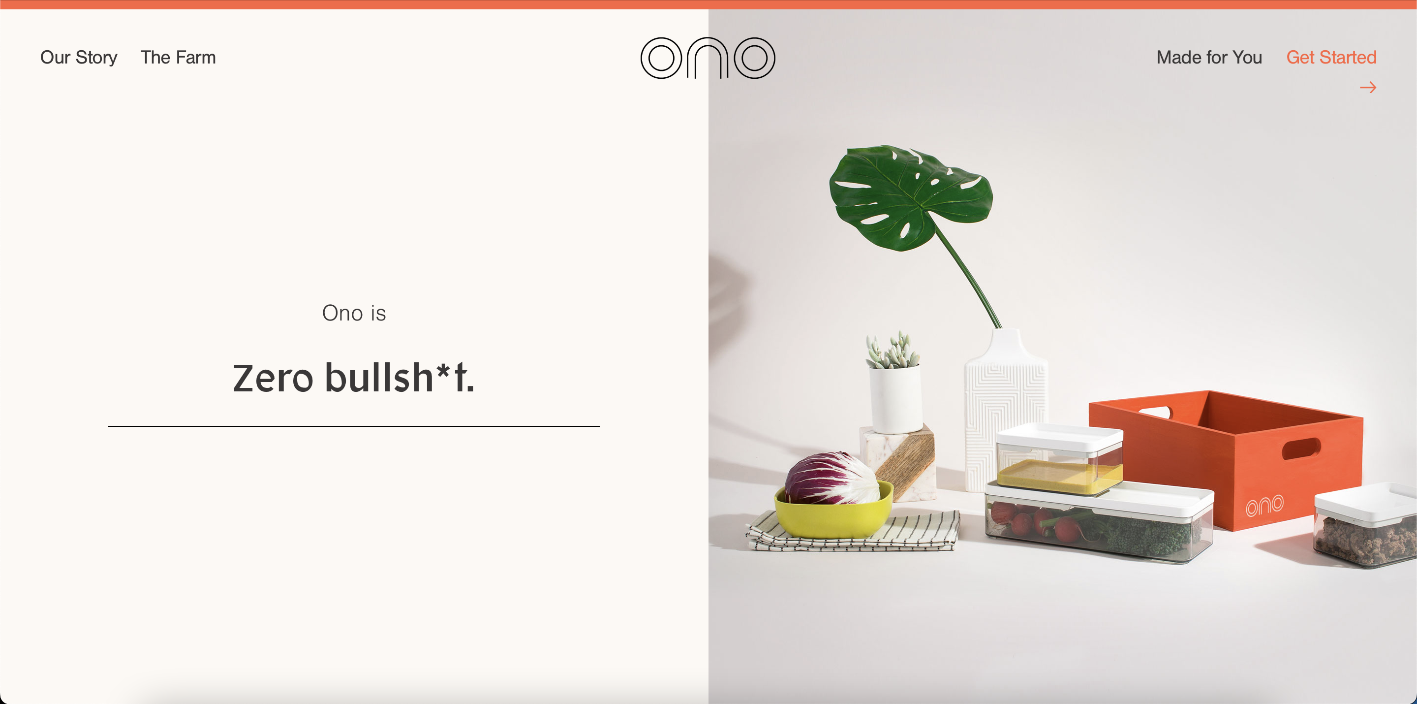
Front page in, I can already feel the personality and image of the brand. Simple layout, but very sleek and clean. The "Zero bullsh*t" phrase also changes the word every few seconds, making the page not static.
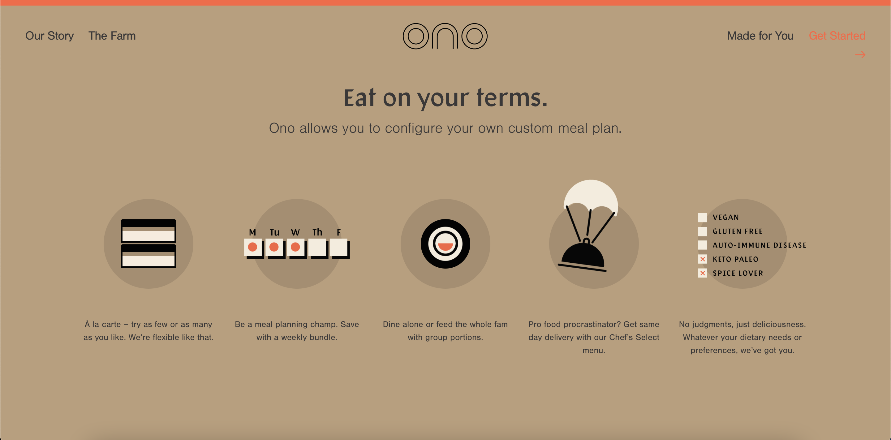
The illustrations on this page breaks up the way the page's two-column structure flows. The illustrations are also animated, drawing attention to the user. The illustrations are easy to understand, not so fancy, but so nice to look at.
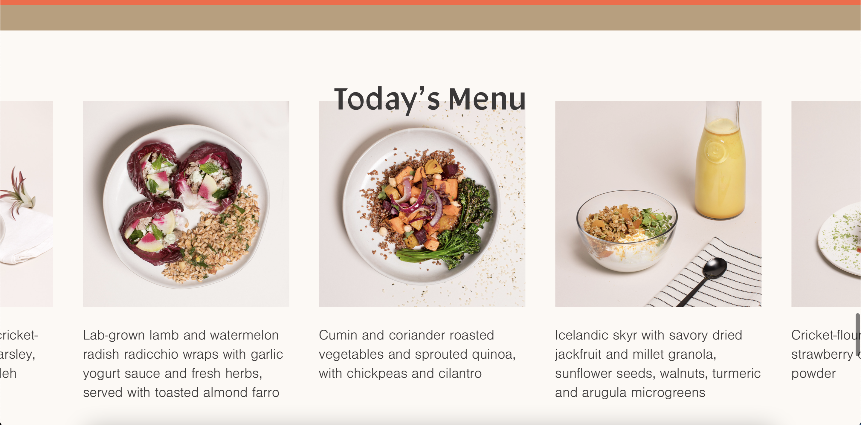
I super love this section of the page because it's a slow image slide that highlights the food so well. The designer took into consideration that people might need time to read the text at the bottom of each picture, which is why the slideshow goes slowly. Also, when I hover over an item, it stops the slideshow and has a CTA button to let me click in the food.
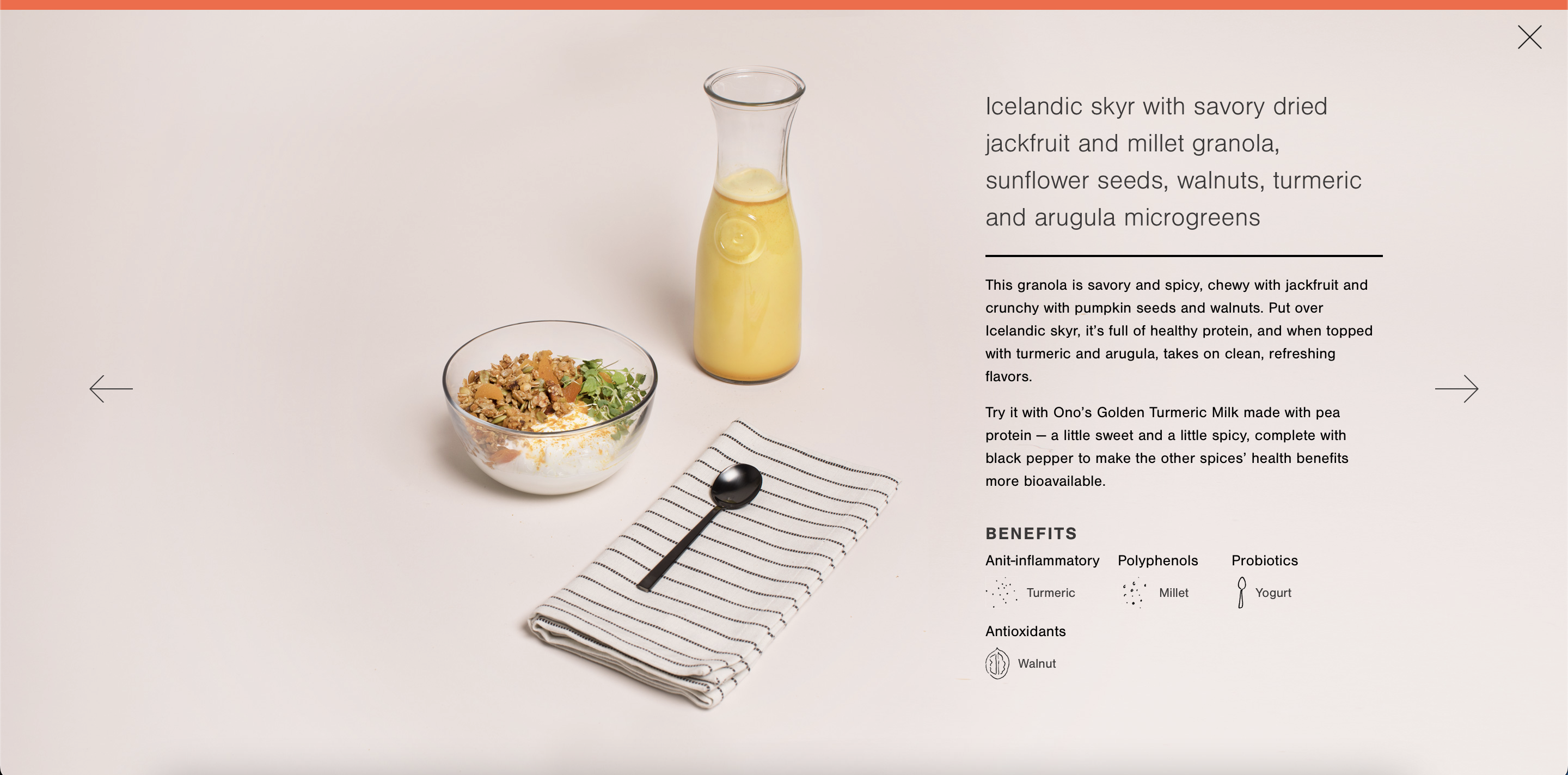
As I click on the food, it expands to a full view which has information about the food. Once again, the type hierarchy is just neat and easy to read. Another thing that I find cool is the background of the image blends in perfectly with the website background. It makes me feel like the product is shown in front of my face.
Date: 5/21/2023
A site that I find inspiring is https://earthmonth.redwoodempirewhiskey.com. What I like about this site is the way they lay out the elements. The layout uses simple logic, but through the use of typography, it makes the site more interesting to look at.
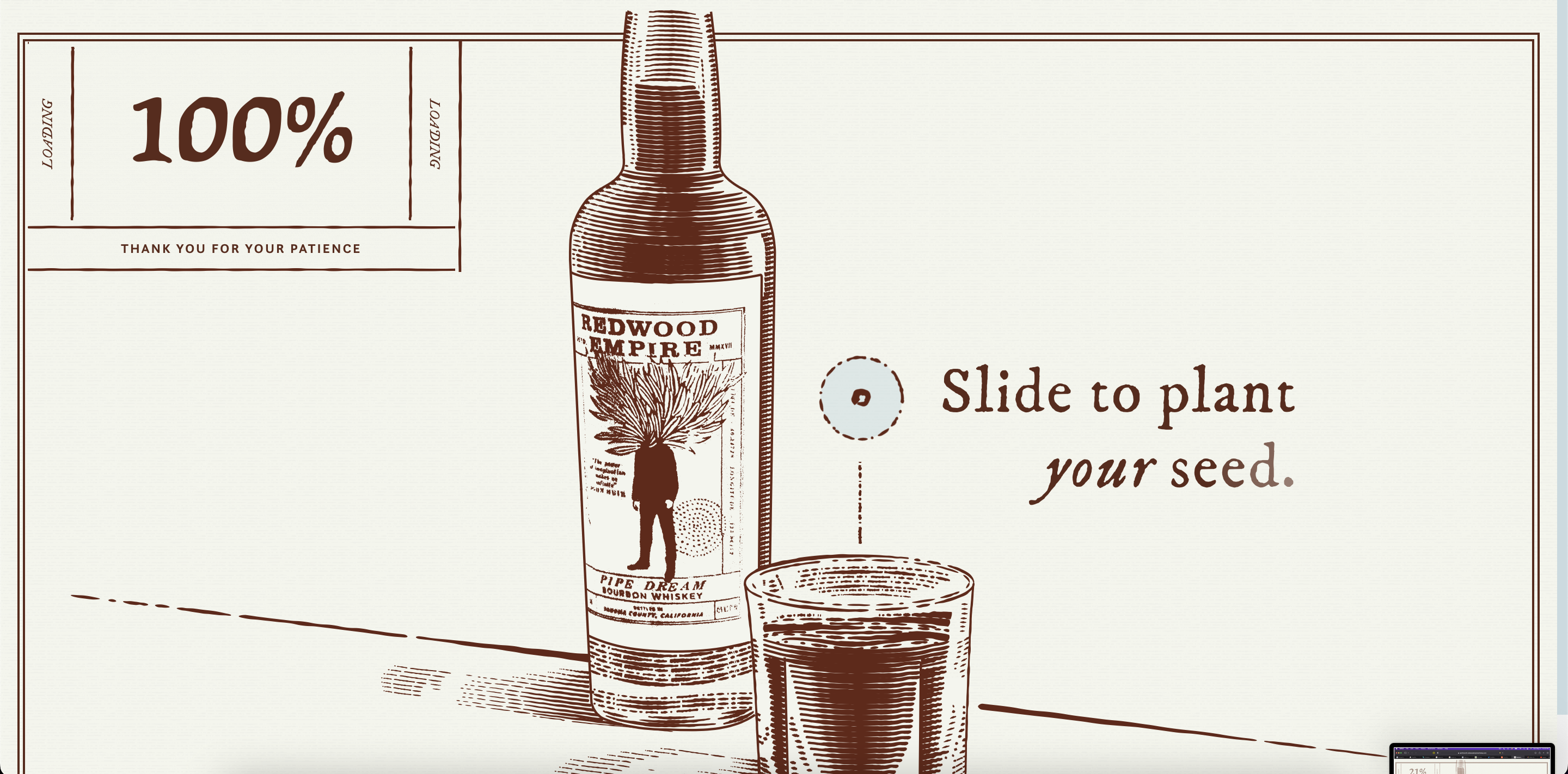
Right as I enter the page, I get to see the loading box that shows the percentage of how much it has loaded. I think this is such a sweet touch because the front page has a lot of negative space, so by including the loading box, it not only interacts with the audience but also making the page more interesting. I also like the slide button in the middle because it requires me to interact with the website. Moreover, it's like part of the story that they're telling.
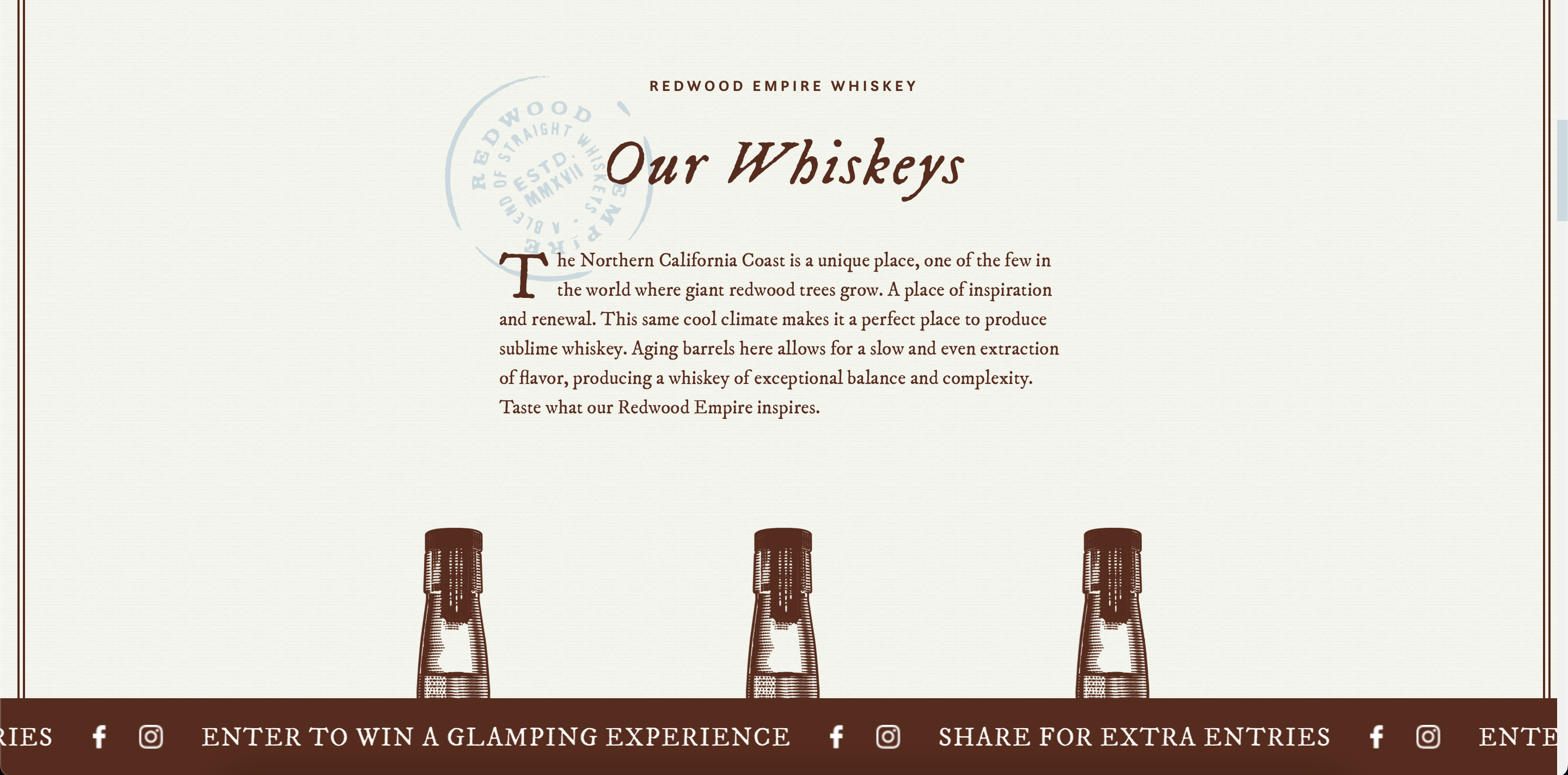
I super love the use of typography on this page because it's very subtle but everything stands out from each other. The contrast between the different groups of text is just beautiful.It looks like there are three different fonts being used, yet they work so well together. The stamp also has more typography, yet still works well with the main text.
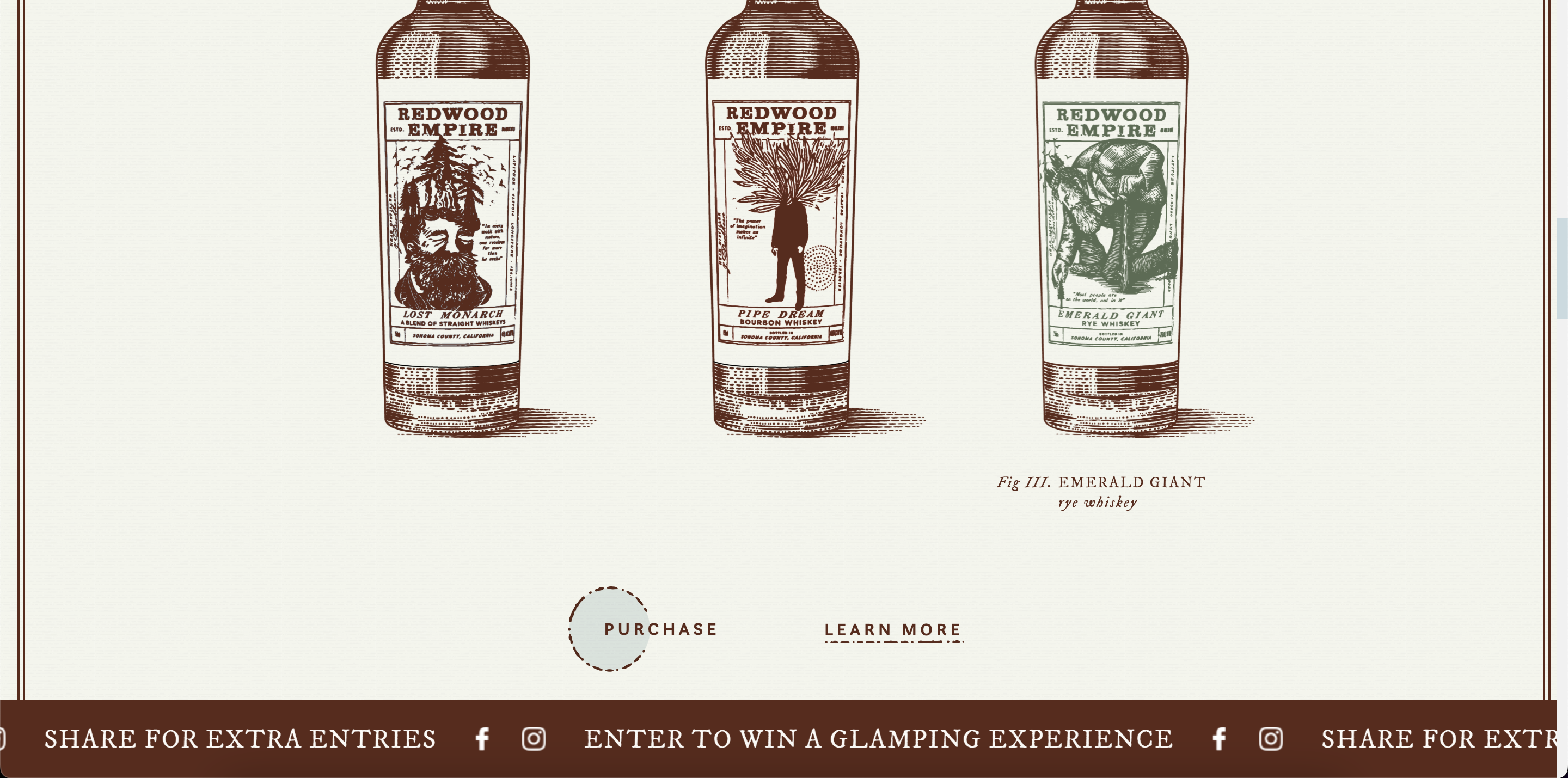
I really like how they showcase their products here. The illustrations are beautiful, and to highlight the products without doing much, they have a color change on hover which makes it fun for the user when they interact with the product. I notice the way they use lines and shapes to highlight their "Purchase" and "Learn More". It's very on brand, draws attention to the CTA's but not being distractive.
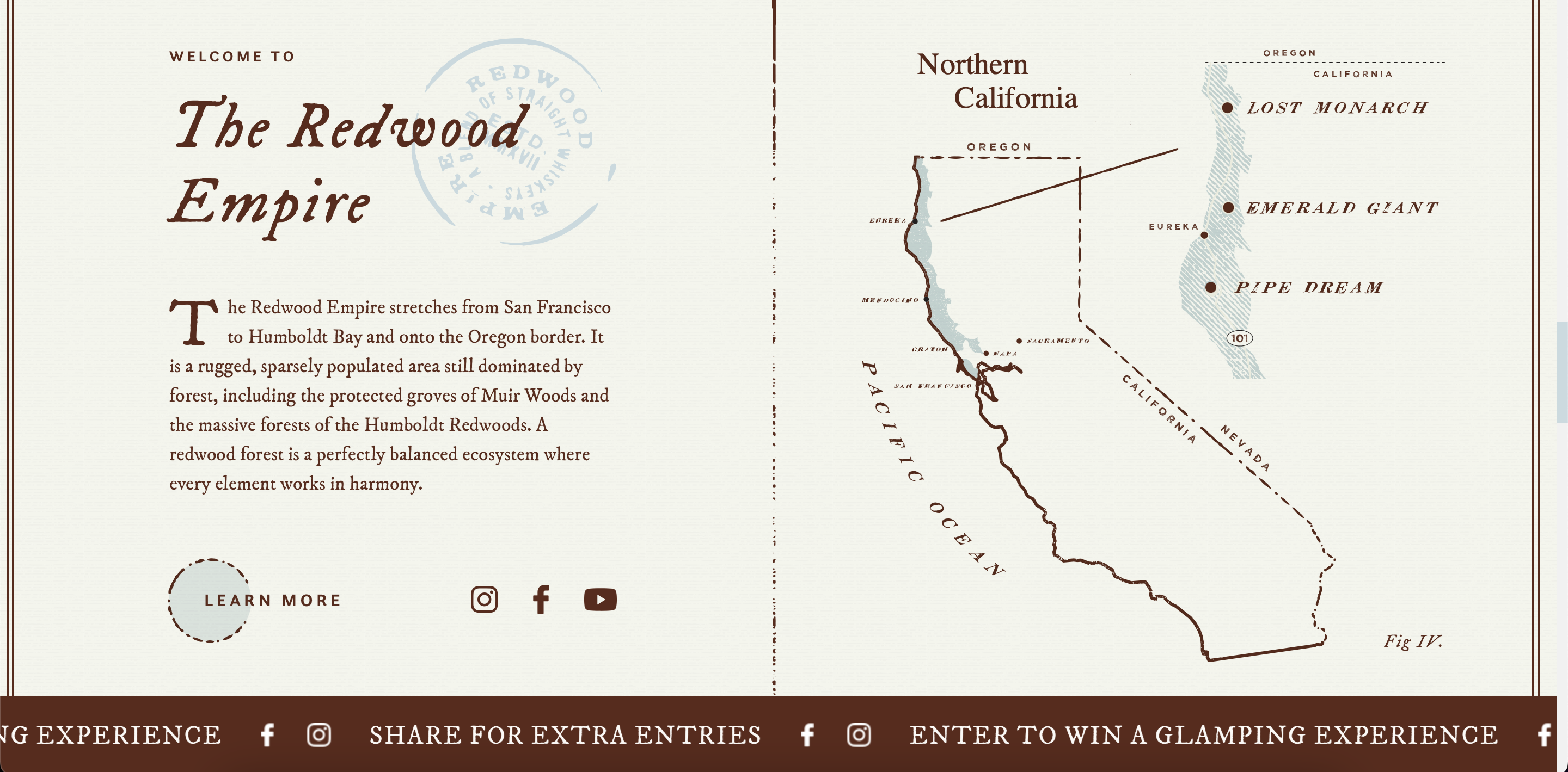
Again here, I just really admire the hierarchy. There are so many different levels, but they do such a good job of making everything legible and readable. The texture on the text goes so well with the graphic and the brand overall. The brand is very monotone, but the slight use of colors makes it a great element for highlighting important things.
Date: 4/11/23
A site that I encountered and really liked is 2019.makemepulse.com. This site has a peaceful and tender narrative but still leaves room for the audience to play around with. I notice that the music in this site reaqlly helped to set the setting of the narrative in. I want to use this type of music in my story.
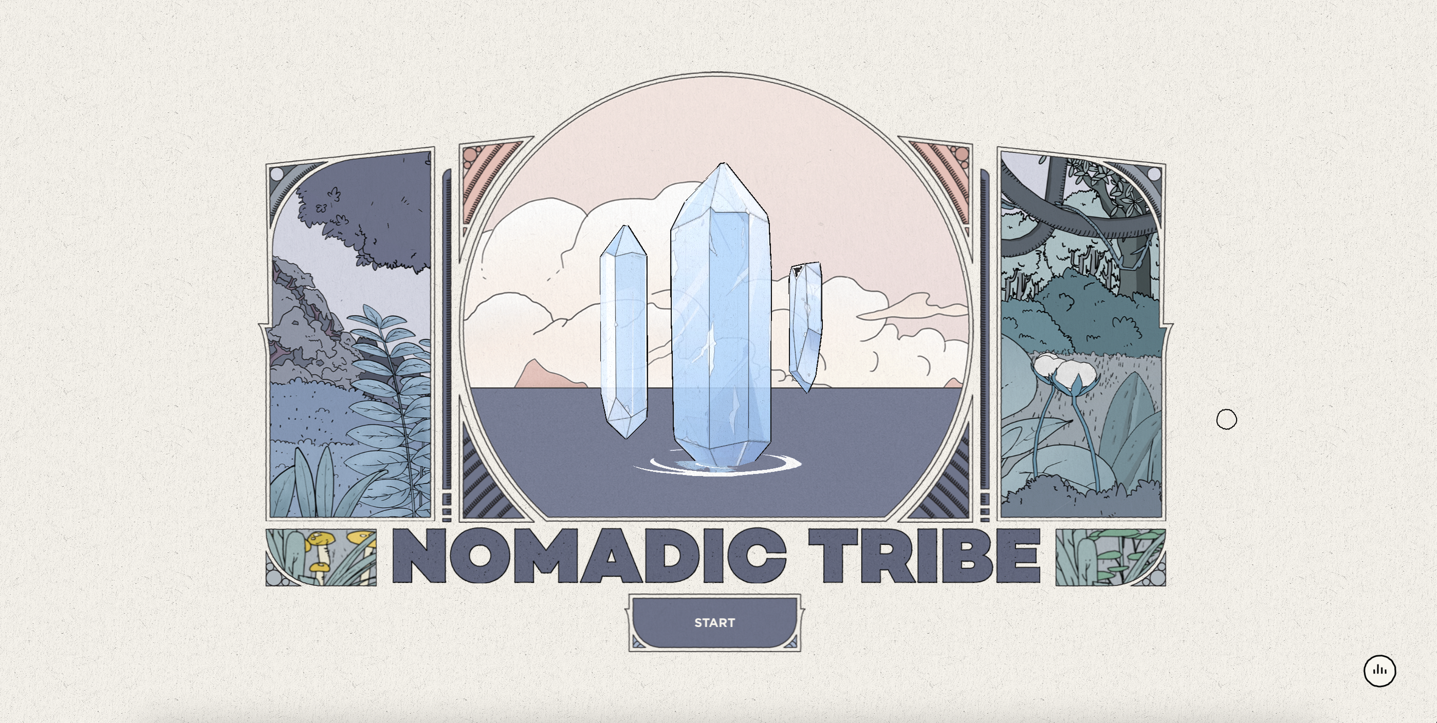
One thing that I like right away from the homepage is the stylized "Start" button. It fits with the drawing, and makes it belong to the story. Buttons are important because they make the story go forward, hence having customized buttons that don't break the aesthethic flow of the story is needed. I also like the customized cursor, so simple but adds characteristic.
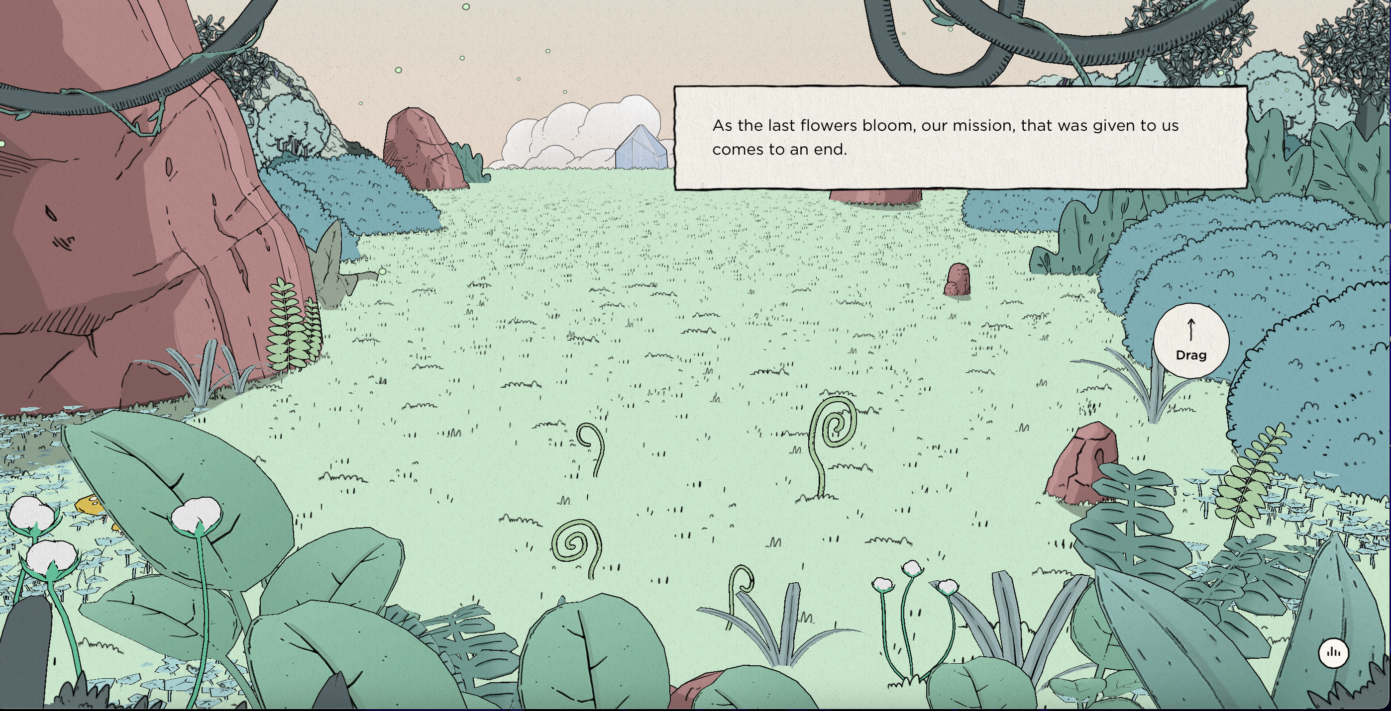
What I like about this second page is the dialogue box. I think this type of box style might fit with my content. Something that looks historical and simple, like the era back then.
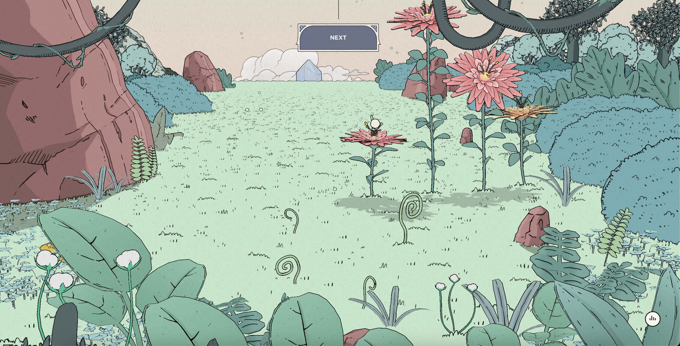
This page is where I'm dragging the flowers up using my cursor. This interactive element allows the audience to play around and stay on the page longer to explore. I really want to use this type of interaction in my project. Another thing that I like about this page is that when you click the "Next" button, the screen goes up. It feels different from the way we usually constructs stories.
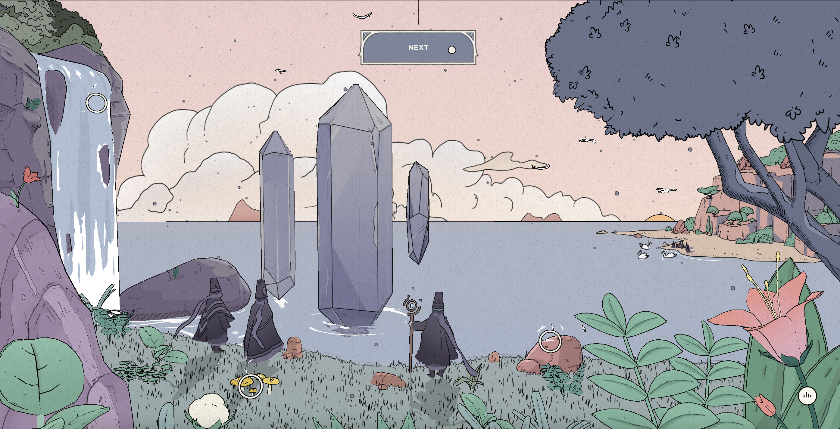
The still image of this screen doesn't show it, but there are different layers of elements here which makes it feel very dimensional. It makes me feel like I teleported into a different world. This inspires me to use some sort of layers in my project. There are subtle movements here too which I also want to use in my project.
Date: 3/20/23
The site that I just visited is www.qaisar.design. What I really like about this site is that it's so interactive, it makes me keep wanting to scroll down.
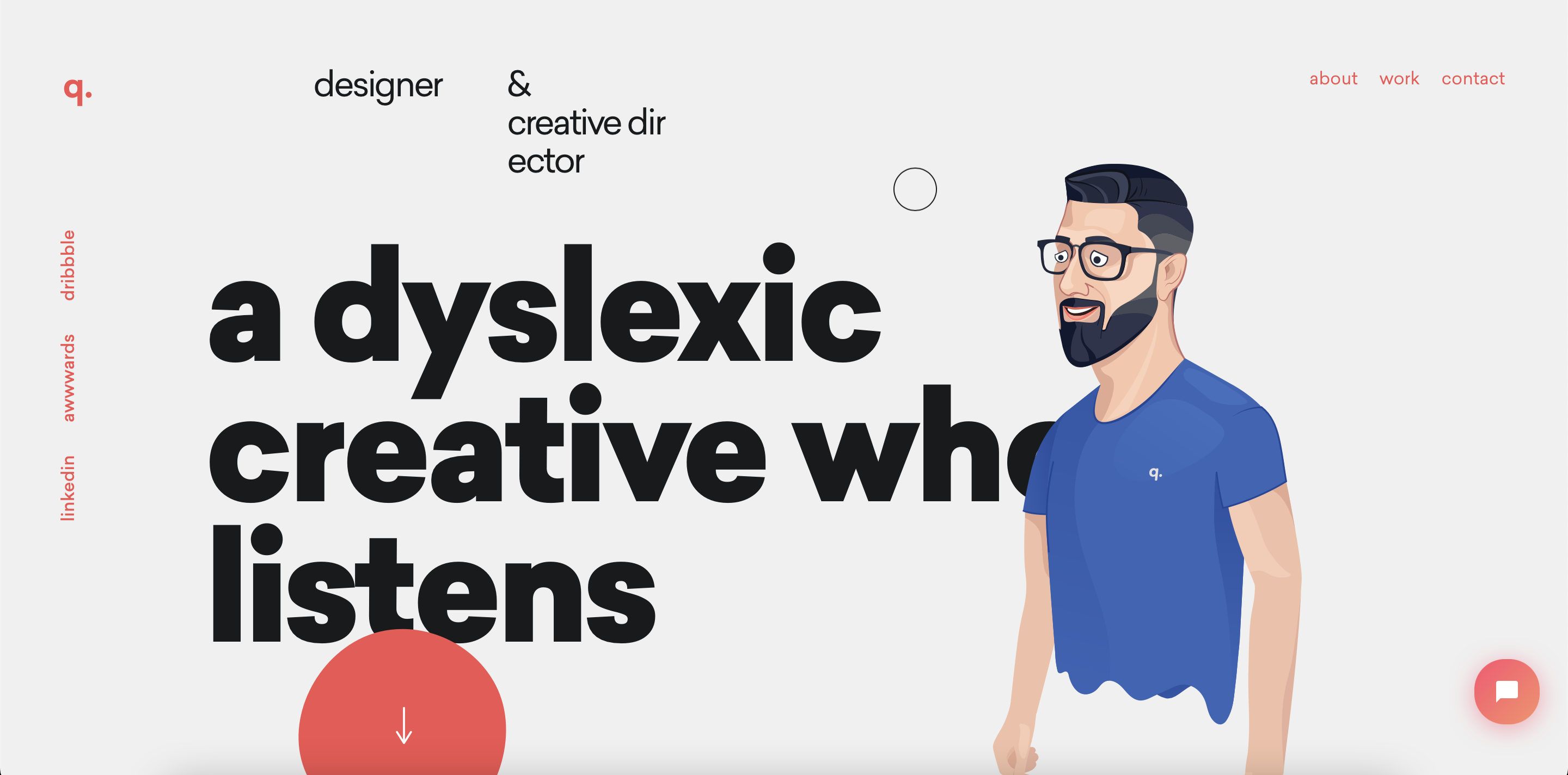
Upon entering the homepage, I see a really dynamic layout with different type hierarchy, an illustration and colors. These elements combined together make the page dynamic. The cursor is also in the shape of a circle and extends to an oval when you move around. I find that pretty cool
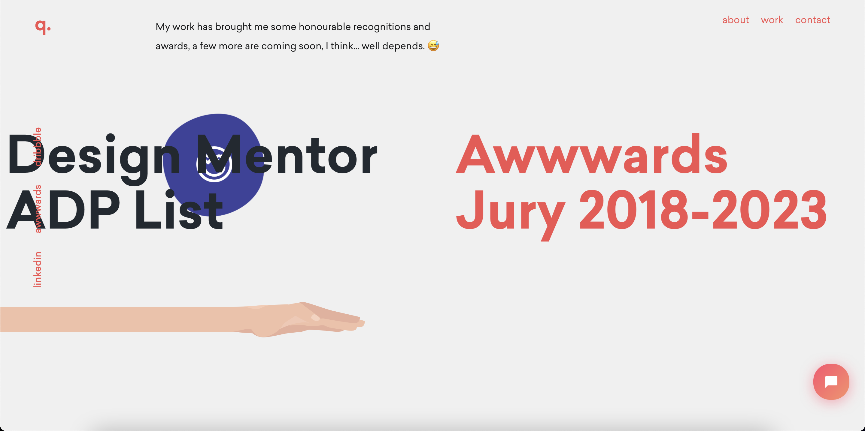
I like how at this part the cursor turns into a blob of circle and has an illustrations when hovered over each award. And each blob has a different color as well.
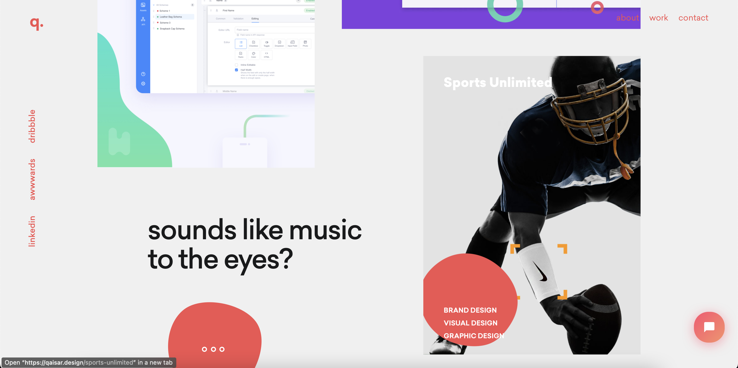
This page is there play he displays his work. I find it cool that each work is like window, and when I hovered over each window, my cursor turns into the orange blob. I can use this blob to move behind the white text, so I can read better. I find it really intriguing to me because it makes me interact with the text.
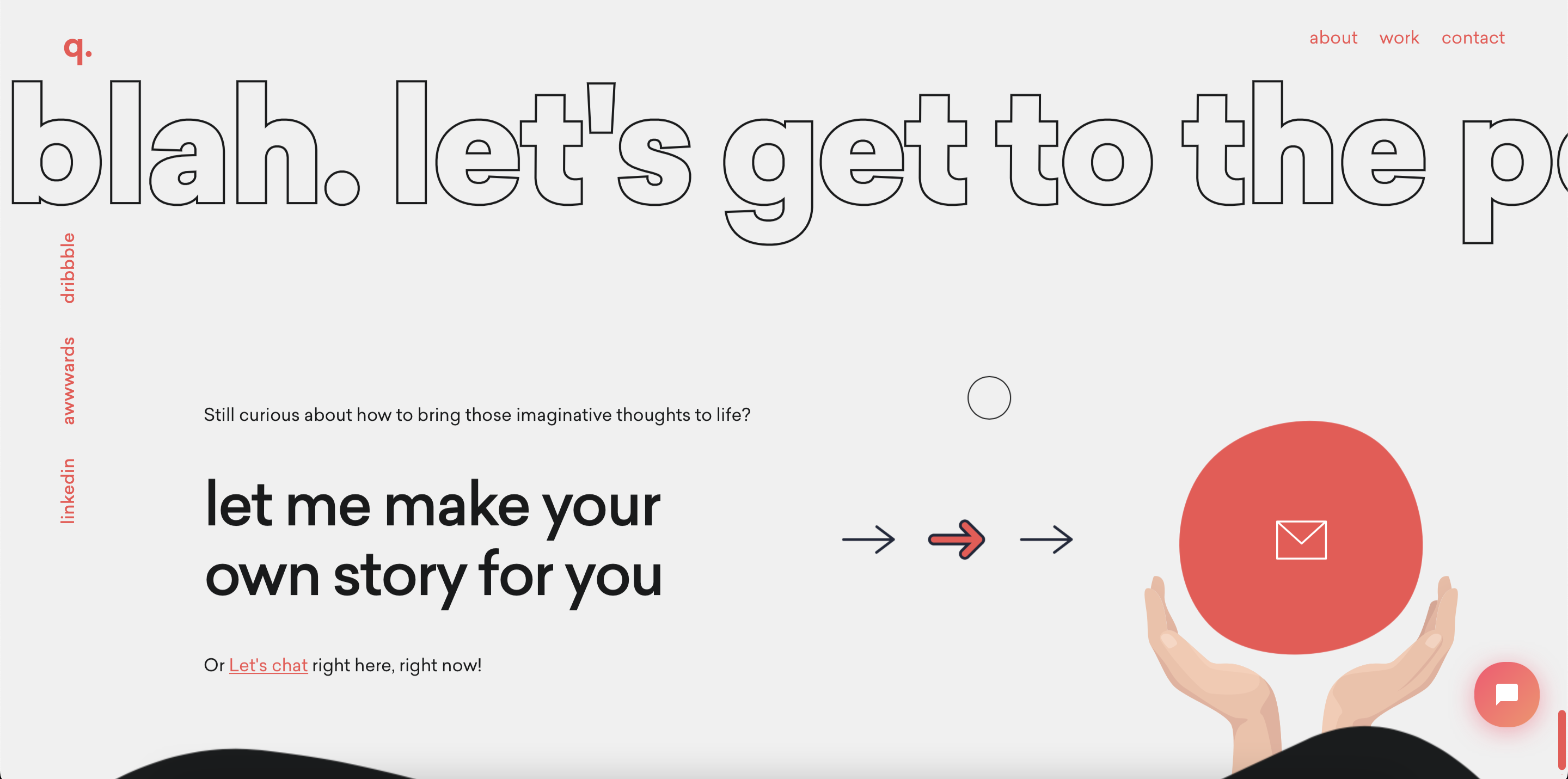
The words outlined are like playing in a slideshow, they keep on moving to the left. I find them neat because they contrast the text at the bottom. The arrows to the right is animated, and it's pointing to the email icon. It's a really nice touch to end the page. I really like this site overall, so playful and interactive. It for sure shows the personality and skills of the developer!
Date: 2/14/23
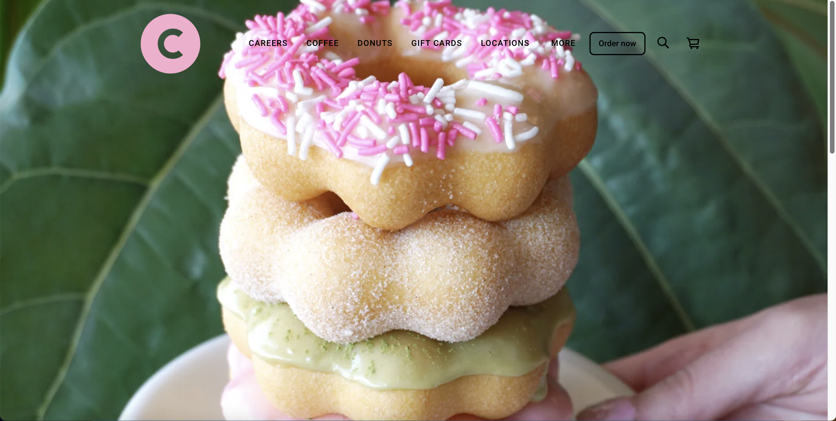
The first site that I want to redo is Coco Donuts. Recently, I've been liking donuts more which is how I came across to this site. The current site is not bad, but I definitely think it can be more engaging. Given that donuts is something sweet and provokes good feelings, the site can be a bit more playful.
If I were to redo this site, I would want to make a spinning mochi donut within the loading screen. I want to make the homepage more appealing, maybe have a side nav to the left to break it away from its usual convention. The homepage will have information about one special donut of the month. If you hover it, it will pop up information about itself. As you scroll down, you will get to the "Donut" page where there are more donuts presented. The donuts will have a picture, name, & price. I want a faint gradient to appear under these donut boxes when they're hovered over. Also, as you scroll down, it updates on the nav bar too. For example, if the person scrolls down to the "Coffee" section, the "Coffee" section in the nav bar will be highlighted. Two other pages that I will do would be the "Coffee" and the "Locations & Hours" pages.
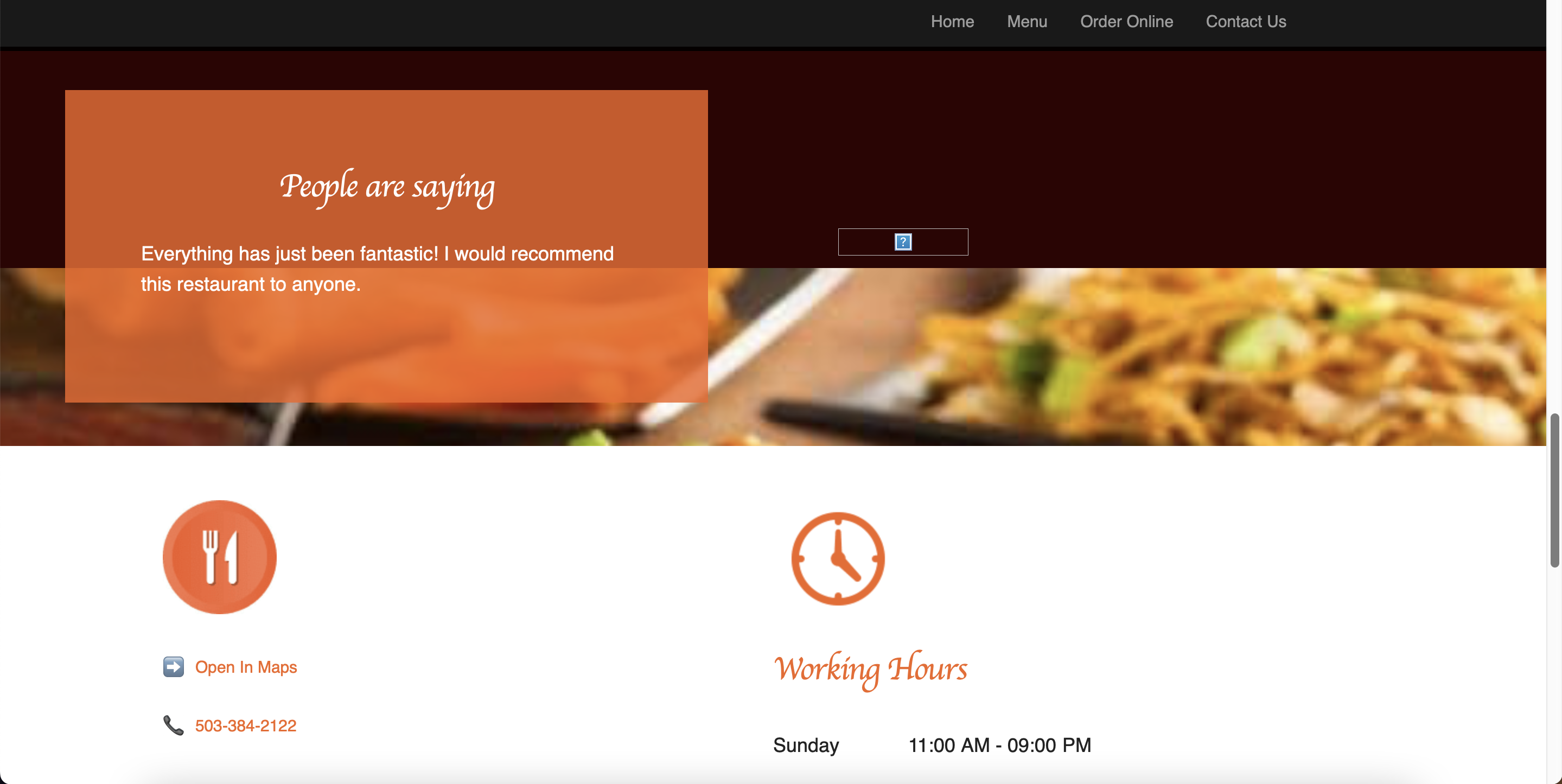
The second site that I would consider redoing is Two Zone Chicken NW. The reason that I wanted to redo this site is because it's underwhelming. Their food looks way too good to have a site that couldnt' show the charm of their food. I feel like the site just feels very default. Although I'm no expert, but I'm confident that I can design a site better than what currently have right now because it is that underwhelming.
With this site, I want to aim for a more professional-looking page, but not like fancy restaurant one. I just wanted it to be more clean and the brand to be more consistent. This one will have the nav that is frequently used. I'm kind of inspired by the color block concept since red seems to be a color related to Korea. On the homepage, there will be a block for the image to be in, I want it to like swap out like cards. As for the menu page, I want it to have a better layout and hierarchy. The menu is pretty long but the texts are too big making the scroll tiresome. I was thinking that maybe I could make a clickable tabs section here so only certain foods should be displayed.
Date: 1/31/23
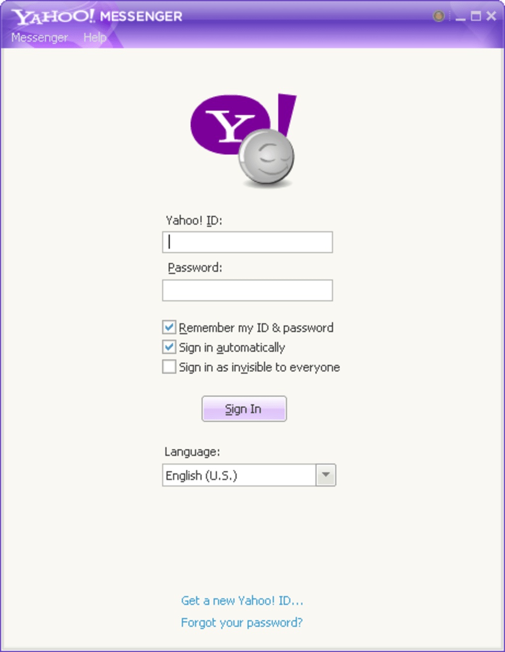
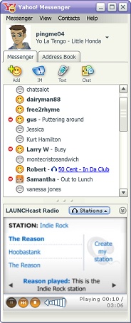
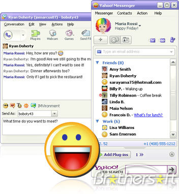
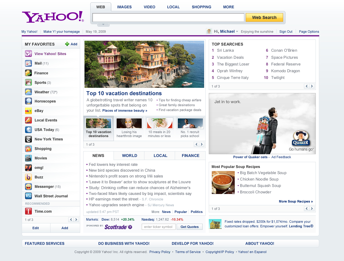
For today's journal entry, I wanted to focus on the old Yahoo which is something I was super obsessed with when I was 8-9 years of age. So when I looked up these pictures of the old Yahoo Messenger and Yahoo itself, it made me think about how Yahoo back then was so much more fun and better. Or maybe because it gave me the nostalgia, so that's why I think it was better back then. I felt it had more characteristic back then, and now it's more basic and minimal. It's so interesting how even though the yahoo back then was not fancy, but it felt better to me. It shows that having a better and cleaner design doesn't always mean good. It's the experience that matters. In my case, the reason I really like Yahoo back then was because of the avatars and the emoticons. There weren't many messenger apps back then which is why Yahoo was enjoyable.
Date: 1/27/23
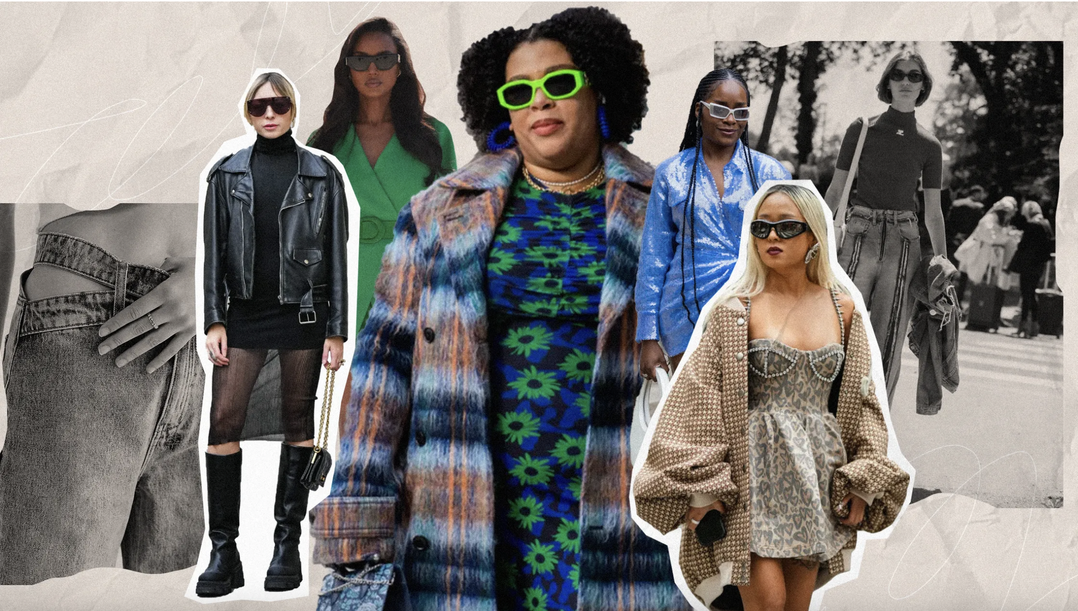
The topic that I chose for this project is “4 Fashion Trends for 2023.” I came upon this topic because I was thinking about a topic that is specifically for 2023. While searching this topic came to my mind. Given that I like looking at fashion, I thought that this topic would be fun to work on. As for the style inspiration, I saw a picture (attached below) in a researching article and then it made me connect to scrapbooks which is something I’ve been into lately. The collage style is something I haven’t done a lot too which is why I thought it would be both fun and challenging to me. This style also allows me to be imperfect and have cut-out pictures that aren’t perfect. I don’t really have a specific site I’m modeling after, just picking up animation inspirations here and there !
Date: 1/16/23
I visited a few websites from the awwwards.com site and the one that caught my eyes the most is kprverse.com
What I really like about this site is how immersive the "scroll transition" is. I think the website really does a good job of keeping a clean minimal layout, yet at the same time making the site feeling very full because of the interactive transition. My screenshots don't quite do the justtice of how amazing this site works but here are some screenshots of the website!
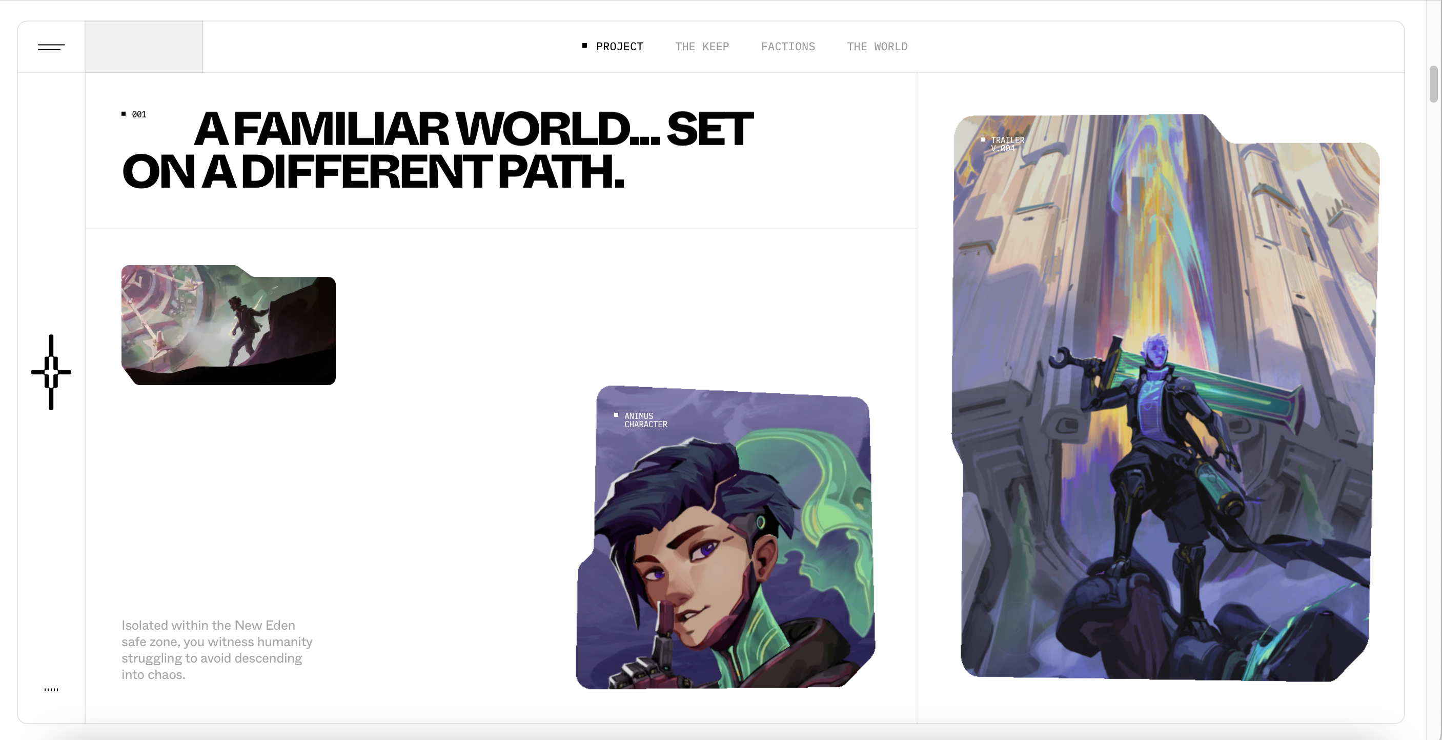
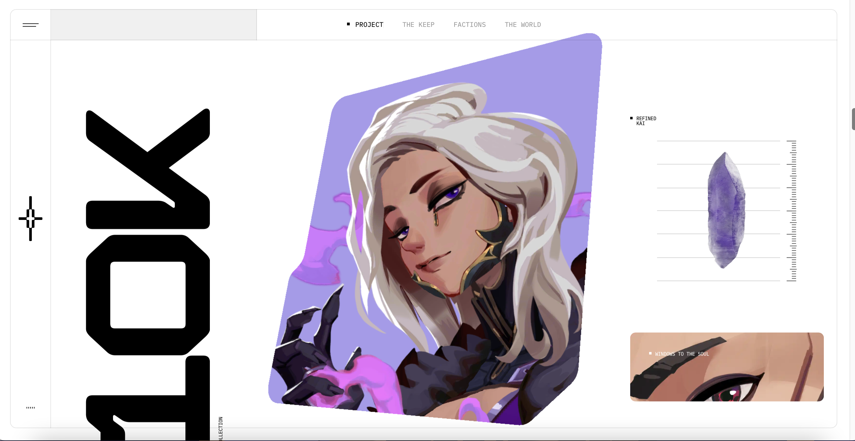
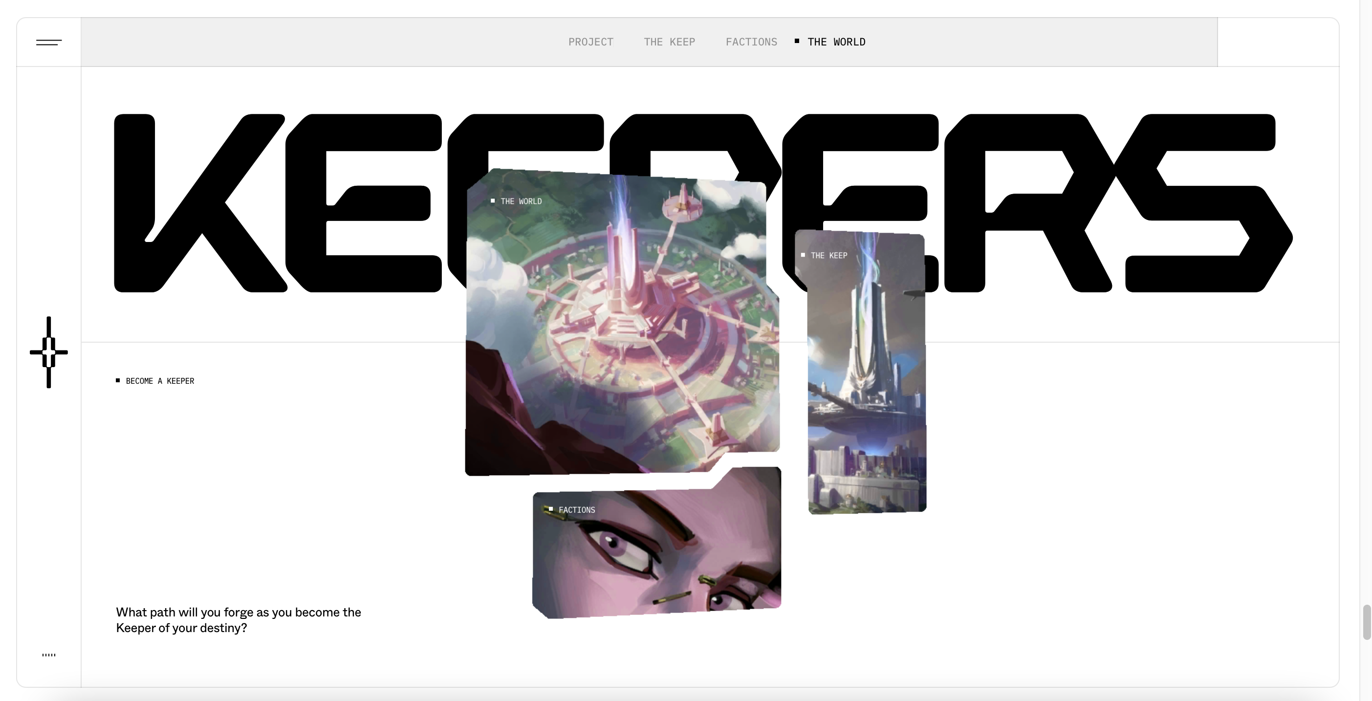
By look through this site it makes me think about how I can use image frames to draw attention. I also noticed the way the clickable words subtle change when you hover your mouse over. I learned that you don't have to make your words big in order to tell people that this is click able. Because users have used many websites, they just know that words that move or change are usually clickable. Also, the placement of the clickable words subtlely hints if they are clickable. In my project, I also would want to have my clickable words/buttons just subtlely change when hovered.
Date: 1/10/23
Here's my first post
